Styling
Introduction
The Autoaddress control comes with default styling provided by the stylesheet hosted via CDN during setup, using standard CSS. Below outlines the possible changes you can make to the control.
Customizing the Design
Getting Started with Customization
To get started with customization, you can inspect our control to identify the relevant selectors you want to modify and apply your CSS rules.
Note: When adding additional CSS rules to override plugin styles, ensure that your custom styles are loaded after the Autoaddress stylesheet. This is crucial to make sure your styles take precedence and avoid conflicts.
Importance of Loading Order: To prevent style conflicts, make sure your custom CSS is loaded after the Autoaddress stylesheet. To get started with customization, you can inspect our control to identify the relevant selectors you want to modify and apply your CSS rules.
Custom Styling for the Autoaddress input
To make sure you are overriding the correct CSS classes we highly recommend using your favourite web inspector tool, ie. Chrome dev tools, select the element you want to change and view the CSS rules currently applied to that element.
To restyle the Autocomplete input, you can do so by selecting the appropriate selector, #autoaddress-input, and then applying your custom styles.
Below is a sample css snippet which shows how to override the default Autoaddress styles to match your needs.
/** Autoaddress custom Styles */

/** Autoaddress input */
#autoaddress-input {
box-shadow: none;
border: 1px solid #cbd5e1;
border-radius: 0;
padding: 8px 16px;
transition: all 0.2s ease-in-out;
}


/** Autoaddress input hover styles */
#autoaddress-input:hover {
border-color: #60a5fa;
box-shadow: none;
}

/** Autoaddress input focus styles */
#autoaddress-input:focus {
border-color: #3b82f6;
}

/** Autoaddress input placeholder styles */
#autoaddress-input::placeholder {
color: rgb(148 163 184/0.8);
font-style: italic
}

/** Autoaddress search button */
#autoaddress-button {
box-shadow: none;
border-radius: 0;
background-color: #60a5fa;
transition: all 0.2s ease-in-out;
display: flex;
justify-content: center;
align-items: center;
}

/** Autoaddress search button hover styles */
#autoaddress-button:hover {
  background-color: #bfdbfe;
}

/** Autoaddress autocomplete list */
#autoaddress-list-container {
  box-shadow: none;
  border-radius: 0;
  border: 1px solid #cbd5e1;
}

#autoaddress-list {
  border-radius: 0;
}

/** Autoaddress individual autocomplete item */
#autoaddress-list li {
  padding: 8px 16px;
  border: none;
  border-bottom: 1px solid #cbd5e1;
}

#autoaddress-list li:hover {
  background-color: #f1f5f9;
}

/** Current selected autocomplete option via keyboard */
#autoaddress-list li.selected {
  background-color: #f1f5f9;
}

/** Autoaddress manual address entry styles */
#autoaddress-manual-enter {
  font-style: normal;
  font-weight: 600;
  background-color: #e2e8f0;
  color: #334155;
  border-radius: 0;
}

li#autoaddress-manual-enter:hover {
  background-color: #cbd5e1;
}
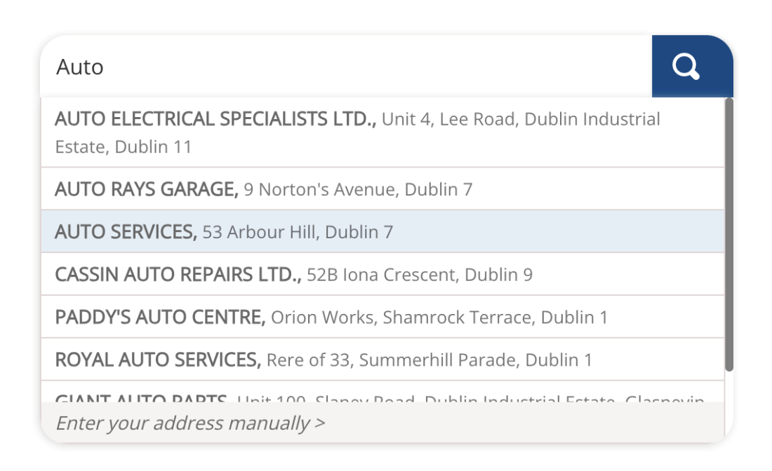
Default CSS
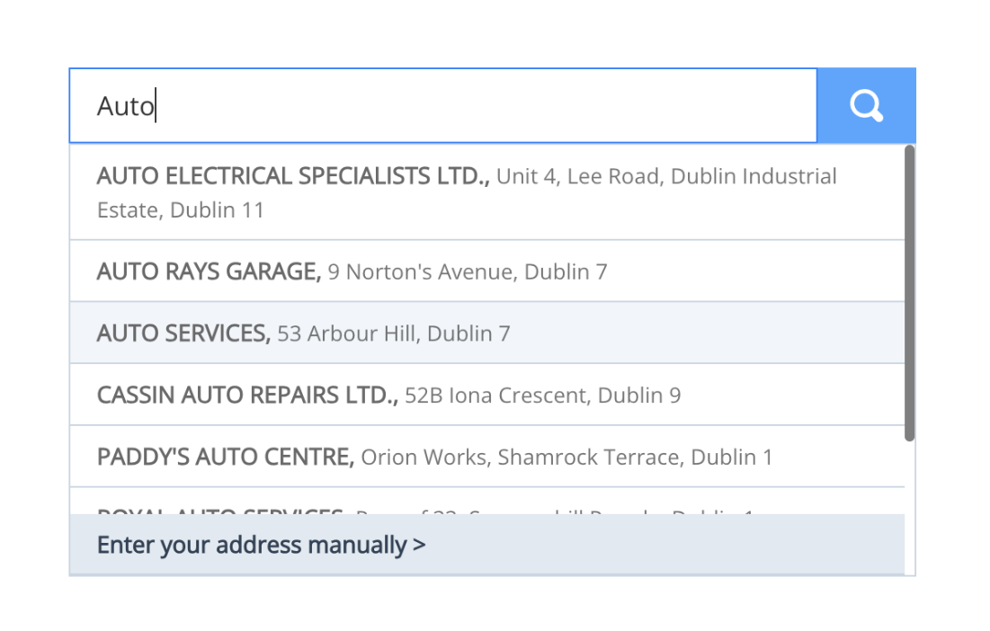
Custom CSS
Key selectors
Autoaddress search
Used by all integration types I.e. Autoaddress form, Combo and Inline.
Selector | Description | HTHTML Element |
#autoaddress-container | Wrapper container for Autoaddress search and form if applicable. | div |
.autoaddress-input-control | Wrapper container for Autoaddress search including input and search button | div |
#autoaddress-input | Selector for the search input text field | input |
#autoaddress-button | Selector for the search Button. | button |
#autoaddress-list-container | Container class for the autocomplete suggestions. | div |
#autoaddress-list | List container for autocomplete options and manual address option | ul |
#autoaddress-list li | Individual autocomplete options | li |
#autoaddress-list li.selected | Currently selected autocomplete option | li |
#autoaddress-manual-enter | “Enter your address manually” button | li |
#autoaddress-back | Back button presented after using drilldown option | ul |
Autoaddress Form Integration Styling
If you're using the Autoaddress form integration type, you can customize the appearance of the localized address form to match your preferences.
Turning off default form styles
By default, the Autoaddress form is styled, and you have the option to override these default styles. However, if you prefer to start with a clean slate and apply no styles to the form, you can achieve this by setting the theme on the Autoaddress control to an empty string (i.e., theme: ""). For more details on how to pass settings, please refer to our settings section.
Key Selectors Autoaddress form
Selector | Description | HTML element |
#autoaddress-form-container | Wrapper container for Autoaddress form. Here is where you can control the spacing around the entire form element. | div |
.enter-manual-label | Target label elements above the form inputs | label |
.enter-manual-text-area | Target the form input fields | textarea |
#autoaddress-form-validation-warnings | Wrapper around form errors list | div |
.autoaddress-error-text | Error style for each individual error, change font color for an error for example here. | p |
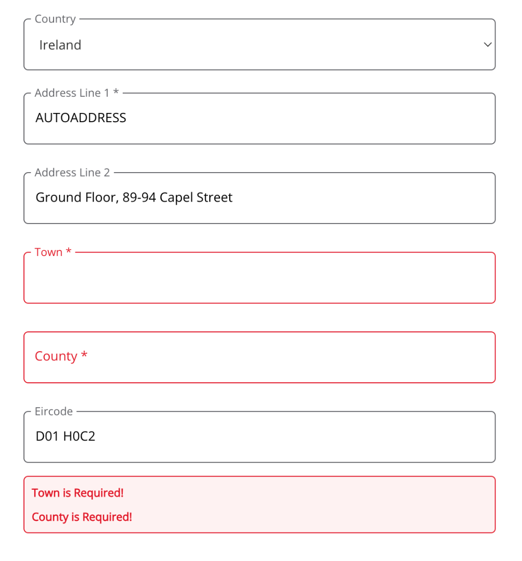
Below is an example of a styled form with custom label and error styles:
/** Autoaddress form container */
#autoaddress-form-container {
  padding: 16px 0;
}


/** Autoaddress form input & selects */
.autoaddress-textarea, .drp-down-select, .enter-manual-text {
  border: 1px solid #626369;
  border-radius: 0.3125rem;
  height: 3.125rem;
  width: 100%;
  padding: 1rem 0.75rem;
  font-weight: 400;
  font-size: .875rem;
  letter-spacing: 0;
  resize: none;
}


/** Autoaddress form input labels */
.enter-manual-label {
  pointer-events: none;
  position: absolute;
  left: 0.75rem;
  top: 50%;
  background-color: #fff;
  transform: translateY(-75%);
  transition: .1s ease-out;
  letter-spacing: 0;
  min-width: auto;
  font-size: .875rem;
  font-weight: 400;
  line-height: 1.25rem;
  color: #626369;
  padding: 0;
  margin: 0;
}


/** Custom label styling if input has focus or value */
.floating-label:has(~textarea:focus),
.floating-label:has(~textarea:not(:placeholder-shown)),
.floating-label:has(~select:focus),
.floating-label:has(~select:not(:placeholder-shown)) {
  .enter-manual-label {
    top: 0;
    font-size: .75rem;
    line-height: 1.125rem;
    left: 0;
    padding: 0 0.25rem;
    margin: 0 0.5rem;
    background-color: #fff;
    transform: translateY(-50%);
  }

}


/** Autoaddress error styling */
.floating-label:has(~.autoaddress-invalid) {
  .enter-manual-label {
    color: #e01a2b
  }

}


.enter-manual-text-area.autoaddress-invalid,
.enter-manual-text-area:focus.autoaddress-invalid {
  box-shadow: none;
  border: 1px solid #e01a2b;
  outline: none;
}


.autoaddress-error-text {
  color: #e01a2b;
  font-size: .75rem;
  margin: 0;
  padding: 0;
  padding-bottom: 0.5rem;


  &:last-child {
    padding-bottom: 0;
  }

}


#autoaddress-form-validation-warnings {
  padding: 8px;
  border: 1px solid #e01a2b;
  border-radius: 0.3125rem;
  background-color: #fef2f2;
  color: white;
  font-weight: bold;

  &:last-child {
    padding-bottom: 0;
  }

}


